Proximity Bias Maps: Separate Rank from Map Rendering for Local SEO Agencies
Proximity Bias Maps: Separate Rank from Map Rendering for Local SEO Agencies

Proximity bias maps are heatmaps or grids that plot a business’s Google Maps ranking at hundreds of coordinates around a service area, showing where visibility holds up and where it drops off. Agencies run them to separate a true distance effect from weak relevance or thin prominence signals, and tools like Maprank build this workflow around repeatable grid scans instead of one-off spot checks.
TL;DR:
- Proximity bias maps reveal how local rankings change across a grid, highlighting decay patterns influenced by category, relevance, and prominence rather than distance alone.
- Building reliable scans requires precise pin placement, consistent query types, appropriate grid spacing, and regular scheduling to account for algorithm volatility and seasonal trends.
- Visualizations like heatmaps and distance-rank curves help interpret coverage and decay, but rendering differences can obscure actual rankings, especially at certain zoom levels.
- A drop-off in visibility often results from competitor density, prominence signals, or category mismatches, not just physical distance from the business location.
- Using programmatic scans via Google Places API supports scale and automation, but results demand careful interpretation and validation before drawing conclusions or informing clients.
Table of Contents
- What proximity bias maps show and why distance isn’t the whole story
- Practical workflow: build a grid scan and collect reliable rank data
- Visualizations and KPIs that turn coordinates into client-ready insight
- Interpreting results and common pitfalls before you blame proximity
- Technical options for programmatic scans using the Places API
- How proximity bias maps compare with other ranking analysis methods
- Examples of real-world proximity bias maps and what they reveal
- Data quality considerations and preprocessing before you trust a map
- Limitations and pitfalls to keep in mind with proximity bias maps
- Common use cases and applications of proximity bias maps
- Reporting results to clients without overstating a single data point
- Agency perspective: maps as diagnostics, not promises
- Maprank: agency-ready grid scans, white-label reports and one-off rank checks
- FAQ
- Sources
What proximity bias maps show and why distance isn’t the whole story
A proximity bias map plots a business’s rank at many points on a grid, but rank and visual map visibility are not the same thing. A listing can retrieve in position 2 for a search and still fail to show a label on the rendered map at certain zoom levels, which is a display limitation, not a ranking problem.
Google’s own guidance on local ranking names three factors that determine local results:
- Relevance: how well a Business Profile matches the search terms.
- Distance: how far each candidate result is from the location used in the search, or implied by it.
- Prominence: how well known a business is, based on signals like reviews, links, and general web presence.
Distance is one of three named factors, not the deciding one, according to Google’s local ranking guidance, which also notes there is no way to request a better local ranking position. A generic “rankings fall off after two miles” claim ignores that every business has its own distance decay curve shaped by its category competition and prominence. The useful output of a proximity bias map is a client-specific curve, not a borrowed rule of thumb.
Practical workflow: build a grid scan and collect reliable rank data
A repeatable scan starts with a few decisions made before the first query runs.
- Set the business pin: use the exact coordinates tied to the Google Business Profile, not a rounded address centroid.
- Pick the queries: test the branded term, the primary category term, and one or two modifier terms (service plus neighborhood, for example).
- Define the scan boundary: match it to the client’s actual service area rather than an arbitrary circle.
- Choose grid shape and spacing: a tighter grid (100 to 250 meters between points) resolves urban cores better; wider spacing suits suburban or rural coverage where cost per point matters more.
- Lock device and context: run scans from a consistent device profile and location context so personalization and session history do not skew results between scans.
- Save a full data record per point: latitude, longitude, query used, device, timestamp, returned position, and the place ID when the API provides one.
- Schedule repeat scans: weekly or biweekly cadence catches algorithm volatility and seasonal competitor movement without burning excess scan credits.
Coverage and cost trade off directly: doubling grid density roughly quadruples the number of points in the same area, so agencies usually tighten spacing near the business pin and widen it toward the service area edges. A local rank tracker built for this workflow handles grid definition and point scheduling without manual spreadsheet setup.
Pro Tip: Keep a fixed grid template per client so month-over-month comparisons track the same coordinates instead of drifting with each new scan.
Visualizations and KPIs that turn coordinates into client-ready insight
Raw rank-per-coordinate data means little until it is colored, banded, and summarized. Most agencies color grid cells by position band, commonly top 1, top 3, top 10, and not found, using a simple traffic-light or heat gradient so a client can read the map in seconds.
- Color cells by position band to make the map scannable without reading individual numbers.
- Calculate coverage KPIs: percentage of grid area in the top 3 and top 10, plus median position across all points.
- Plot a distance-rank curve: median rank per distance band shows the decay pattern more honestly than any single point.
- Decide when to show raw scatter versus a smoothed curve: raw points reveal volatility, smoothed curves reveal trend.
| Visual | What it shows | Best use |
|---|---|---|
| Color-coded heatmap | Area-level visibility by position band | Client-facing overview of coverage |
| Distance-rank curve | Median rank by distance from the pin | Diagnosing decay pattern and its steepness |
| Position distribution chart | Share of grid cells in top 1, top 3, top 10, not found | Tracking change over time |
Export files for clients need a legend that defines each color band, a note on scan date and device context, and a short disclaimer that the map reflects measured positions at the time of the scan, not a guarantee of future ranking. A geo grid rank tracker view of coverage and visibility KPIs gives agencies a starting template for this kind of report.
Interpreting results and common pitfalls before you blame proximity
A weak outer ring on a grid map is not automatic proof of distance bias. Run a short diagnostic pass before drawing conclusions.
- Confirm query intent: a category term pulls a different candidate pool than a branded search, and the two will never produce matching curves.
- Check profile categories and services: a missing or mismatched primary category can suppress relevance regardless of distance.
- Review prominence signals: review volume, review recency, and link mentions often explain a drop-off better than raw distance does.
- Assess competitor density: a cluster of strong competitors near certain grid points can depress rank independent of distance.
Map rendering adds another layer of noise. Research into Google Maps’ ranking architecture describes a separate rendering stage, sometimes called Mapcore, that decides which labels actually display on the visual map. A business can be eligible and well-ranked in the underlying results yet still not show a label at a given zoom level, which means a screenshot alone can mislead a client who assumes rendering equals rank.
Pro Tip: Treat a proximity bias map as a diagnostic lead, not a verdict: confirm category, prominence, and competitor density before telling a client distance is the root cause.
Attribute a pattern to true distance bias only after relevance and prominence check out and the decay curve is smooth and consistent across repeat scans; a jagged, inconsistent curve usually points to rendering noise or data quality issues instead.
Technical options for programmatic scans using the Places API
Agencies running scans at scale usually script against Google’s Places API rather than scanning manually. The searchNearby method accepts a rankPreference parameter set to either DISTANCE or POPULARITY, which changes how results are ordered and matters directly for grid scans built around location.
- RankPreference DISTANCE orders by proximity to the search point, useful for confirming what shows up nearest a grid coordinate.
- RankPreference POPULARITY orders by relevance and prominence signals rather than raw distance, which better approximates what a typical searcher sees.
- Radius and locationRestriction support values up to 50,000 meters, and radius is disallowed when ranking by distance under the legacy Nearby Search parameters.
- Request minimal reliable fields: displayName, location, formattedAddress, and the Google Maps URI are enough for most mapping needs without inflating request cost.
The Nearby Search (New) documentation covers maxResultCount, includedPrimaryTypes, and pagination behavior, all relevant when batching hundreds of grid points into a scan run. Rate limits make batching and field selection worth planning before a scan job starts rather than after it times out.
How proximity bias maps compare with other ranking analysis methods
Single-point rank checkers remain the fastest way to answer “where do I rank right now,” but they answer it from exactly one coordinate, usually the business address or a city centroid. That single number tells an agency nothing about how rank changes three blocks away, which is the gap grid-based proximity maps are built to close.
Manual search sampling, where someone runs searches from a few physical locations or spoofs a handful of coordinates by hand, sits between the two. It catches obvious distance effects but rarely has the point density to build a reliable decay curve or to separate rendering noise from an actual ranking drop.
Share-of-voice tools that aggregate rank across many keywords without a geographic grid solve a different problem: they’re useful for tracking keyword breadth but blind to the spatial pattern that matters most for a storefront business competing on “near me” searches. A grid scan paired with a distance-rank curve is the only approach among these that shows both the spatial pattern and lets an agency isolate distance from relevance and prominence, since the other methods either lack the coordinate density or the comparison points needed to tell the two apart.

The trade-off is cost and setup time. A proximity grid takes more scan credits and more planning than a single rank check, so many agencies run single-point checks for quick client questions and reserve full grid scans for audits, onboarding, and recurring reporting where the spatial detail earns its cost.
Examples of real-world proximity bias maps and what they reveal
A dense-grid scan for an urban business often shows strong top-3 coverage within a half mile of the pin, a transition zone where rank oscillates between top-3 and top-10 with no smooth pattern, and a clean drop to not-found past a given distance. The transition zone is the most diagnostically useful part of the map, since it usually coincides with where competitor density starts increasing rather than with distance alone.
A suburban or rural scan with wider grid spacing tends to show a gentler, more linear curve: fewer competitors mean prominence and relevance matter relatively less, and distance behaves closer to what intuition expects. This is the pattern most likely to support a genuine proximity bias conclusion.
A multi-location business comparing two branches in the same metro area frequently shows asymmetric curves: one location decays sharply within a mile while the other holds top-3 coverage well past two miles, despite similar profile quality. The difference usually traces back to local review volume or a category mismatch at one location rather than anything about the physical distance itself, which is exactly the kind of finding a single spot check would never surface.
Data quality considerations and preprocessing before you trust a map
A proximity bias map is only as reliable as the raw scan data behind it, and a few quality checks catch most of the problems before they reach a client report.
Confirm the business pin matches the live Google Business Profile coordinates rather than a geocoded street address, since the two can sit meters or even blocks apart in dense areas. Check that every query variant used in the scan reflects what real searchers type, not an agency’s internal shorthand for the service. Flag and exclude grid points that returned errors, empty results, or an obviously stale cache rather than averaging them into the dataset as if they were valid zeros.
Store the full scan schema for every point, including latitude, longitude, query, device context, timestamp, returned position, and the place ID when available, so an anomaly can be traced back to its source later instead of being guessed at. When comparing scans across time, confirm the grid template itself did not shift, since a changed boundary or spacing will produce a curve that looks like a ranking change but is really a measurement change.
Limitations and pitfalls to keep in mind with proximity bias maps
A proximity bias map measures a moment in time, and Google’s local results shift with algorithm updates, competitor activity, and review velocity, so a single scan is a snapshot rather than a trend. Rendering limitations add a further layer: Search Engine Land’s analysis of Maps architecture notes that label display is governed by a separate rendering stage from retrieval, which means a map screenshot can under-represent a business that is actually ranking well underneath.

Grid density is a trade-off, not a free improvement: a very tight grid near the pin can create a false sense of precision while still missing the service area’s true edges if spacing widens too quickly further out. Query selection matters just as much as geography; testing only a branded term will produce a flatter, more favorable curve than a competitive category term would, and reporting the wrong one to a client either overstates or understates the real visibility gap.
Finally, a map built from manual, infrequent scans is vulnerable to one-off volatility. A steep drop seen on a single scan date deserves a second scan before it becomes a client recommendation, since algorithm noise and temporary competitor changes can produce a curve that looks like permanent distance bias but corrects itself within days.
Common use cases and applications of proximity bias maps
Agencies lean on proximity bias maps at several points in a client relationship. During an audit or a new client pitch, a grid scan gives a concrete, visual starting point that is far more persuasive than a single rank number pulled from the client’s own search.
- Service area planning: a map shows whether a client’s claimed service area matches where they actually show up in results.
- Multi-location comparison: scanning each branch on its own grid surfaces which locations need prominence work and which have a structural distance problem.
- Competitor gap analysis: overlaying competitor density onto the same grid shows where a client is genuinely outranked versus simply farther from the search point.
- Campaign tracking: repeat scans after a review campaign or citation cleanup show whether the visibility gap actually closed.
Each of these uses depends on treating the map as one input into a larger diagnosis rather than a standalone verdict, since the same visual pattern can have different root causes depending on the client’s category and market.
Reporting results to clients without overstating a single data point
A client report built around one rank number invites the wrong question: “why did my rank change?” when the real story is usually a shift in the distribution, not a single point. Showing the full grid, the position distribution, and the distance-rank curve together gives a client an honest picture of where visibility is strong, where it is marginal, and where it genuinely falls off.
Label every map and chart with the scan date, the query used, and the device context, since a client comparing two reports months apart needs to know whether the methodology stayed consistent. Note explicitly when a pattern looks like rendering noise rather than a true ranking change, and avoid presenting a single improved grid point as proof that a broader campaign worked.
Framing a report around “percentage of the service area in the top 3” or “median position across the grid” gives a client a metric that moves meaningfully between scans, rather than a single coordinate’s rank that can swing on noise alone. A Google Maps rank tracker built around grid output makes this distribution-first format the default rather than an extra step for every report.
Agency perspective: maps as diagnostics, not promises
A proximity bias map earns its place in an audit when it is framed as a starting hypothesis, not a guarantee of what will happen next. Use it to justify specific next steps, a review push, a service area adjustment, rather than a blanket promise that rankings will improve. Maprank’s custom grids and white-label reporting support that framing without extra setup work.
— Local
Maprank: agency-ready grid scans, white-label reports and one-off rank checks
Running proximity bias maps by hand across a growing client list eats billable hours fast, and that is the exact friction Maprank is built to remove. Its customizable scan grids match the workflow described above, letting an agency define boundary, spacing, and query variants per client instead of forcing every account into the same template.
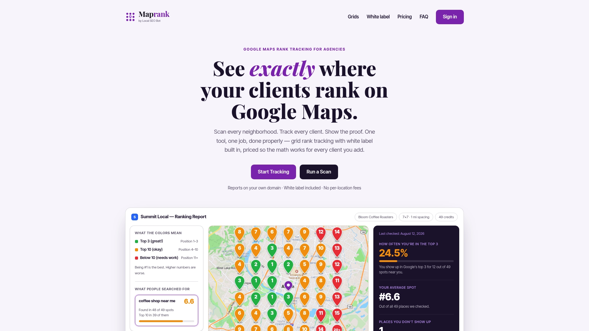
- White-label reporting on the agency’s own domain means clients see a branded map, not a third-party tool’s interface.
- Unlimited businesses on every plan avoids the per-location fees that make scaling a client list expensive with other trackers.
- Credit-based scans keep pricing predictable instead of penalizing an agency for adding accounts or team seats.
- No Google account integration required means a scan can start without asking a client for access credentials.
Agencies that want to test the workflow on a single client can start with a one-off rank check before committing to a plan, or compare the four tiers, Maprank Solo, Maprank Agency, Maprank Pro, and Maprank Scale, directly on Maprank.
FAQ
What is a proximity bias map in local SEO?
A proximity bias map is a grid-based visualization showing how a business’s Google Maps ranking changes at different coordinates around a service area. Agencies use it to see whether rankings fall off with distance from the business or stay stable, which helps separate a true proximity effect from relevance or prominence problems noted in Google’s own local ranking factors.
How is proximity different from relevance and prominence in Google’s ranking?
Distance is one of three factors Google names for local ranking, alongside relevance (how well a profile matches the search) and prominence (reputation signals like reviews and links), according to Google’s Business Profile help. None of the three is described as dominant, so a visibility drop at the edge of a grid can come from weak prominence or a category mismatch instead of distance alone.
Can I automate proximity bias map scans with the Google Places API?
Yes. The Places searchNearby method supports a rankPreference parameter set to DISTANCE or POPULARITY, along with location restriction up to 50,000 meters, which covers most grid scan use cases when batched across coordinates.
Why does my map show a business ranking well but the label is missing?
Map rendering runs as a separate stage from retrieval, so a business can be eligible and well-positioned in the underlying results while its label is suppressed on the visible map at certain zoom levels. Search Engine Land’s reporting on Maps architecture describes this rendering stage, which is why a screenshot alone should never be treated as definitive proof of rank.
What tool can agencies use to run proximity bias maps for clients?
Maprank is built specifically for agencies running grid-based rank scans, with customizable grid sizing, white-label client reports, and unlimited businesses included on every plan. Pricing runs on scan credits with tiered plans; current prices are available on Maprank.
Sources
- Tips to improve your local ranking on Google - Google Business Profile Help
- Inside Google Maps: 72 ranking signals and the architecture behind local search
- Method: places.searchNearby | Places API | Google for Developers